|
CompPanels: Images from the Annals of Composition #41 Telling Book Covers (VII): Repurposing and Literality |
|
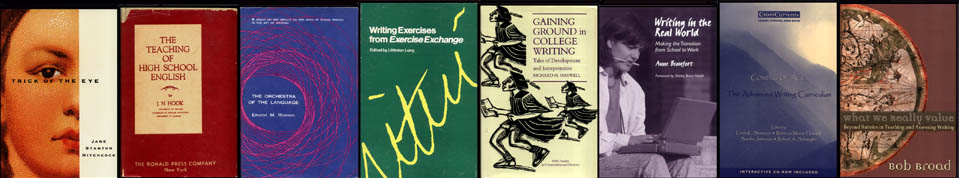
Here is a rogues gallery of book covers, all but one from the field of composition studies. They offer a bit of historical perspective and a bit of disciplinary perspective. The first in line is decidedly out-field. It's Chip Kidd's cover (enlarge) for a suspense novel by Jane Stanton Hitchcock, Trick of the Eye, which Dutton published in 1992. The design serves as Kidd's own example of an artistic technique he calls "repurposing." To repurpose, the book-cover artist begins with a found object and then transforms it so that it is "taken completely out of its previous context." With Hitchcock's cover he worked from a photostat of an image on the top of a box of Jean Valjean Cuban cigars. The trick, however, is cleverly appropriate to the novel, whose setting is the world of high art and whose detective hero is an artist herself, specializing in trompe-l'oeil. Can repurposing, in Kidd's sense, be found in composition-studies book covers? Actually, not much that I've seen. What their history shows is almost the opposite, a kind of fixation on the literal. Instead of imaginative transformations from one human sphere to another, we get enhancements of the prosaic stuff already found in the composition field. Instead of repurposing we get refurbishing. Scan my chronological lineup of covers. The dustcover (enlarge) of J. N. Hook's scholarly The Teaching of High School English (Ronald Press, 1950) consists of nothing but words except for one inconspicuous decorative fleuron, typical of books of its era that wanted to look, well, scholarly. Ernest M. Robson's The Orchestra of the Language (Thomas Yoseloff, 1959) is an early instance of the turn toward pictorial jackets in academic books, but the design (enlarge), though aesthetically appealing, is an imitation of sound wave patterns. The acoustics of English is, in fact, Robson's topic. The cover (enlarge) to Littleton Long's collection of writing exercises from Exercise Exchange (National Council of Teachers of English, 1976) offers just the word "writing," handwritten and enlarged as if a myopic English teacher were getting very close to see if the word isn't misspelled with two t's. I include the dustcover (enlarge) to my own Gaining Ground in College Writing (Southern Methodist University Press, 1991) because it comes with a little inside information about composition-studies attitudes toward academic book covers. The assistant editor sent me a mock-up of the cover, worried because "Our designer got creative" and wondering if I found the design "reasonably relevant to the content of the book." It seems covers shouldn't be too imaginative or too indirect—in other words, shouldn't repurpose. And indeed the cover (enlarge) to Anne Beaufort's Writing in the Real World (Teachers College Press, 1999) is about as unimaginative and direct as you can get. Befitting a study of real-world composing, here is photographic proof in black and white of a person literally writing in the real world (don't ask why she has a pencil in her mouth). Photographs are popular now in composition-studies book covers. The one (enlarge) for Linda Shamoon, Rebecca Howard, Sandra Jamieson, & Roberet Schwegler's Coming of Age: The Advanced Writing Curriculum (Boynton/Cook Heinemann, 2000) provides a telling variant. What does this scape of misty mountains have to do with college writing courses? If there is no connection of the cover with the book's purpose, there can be no repurposing. The design, pleasant enough but purely decorative, would bring us full turn back to the meaningless flourish on the cover of Hook's 1950 book. But perhaps the mountains metaphorically allude to the book's topic of advanced writing or upper-division composition courses? That would lead to my one clear example of repurposed art from the world of composition-studies book covers. For Bob Broad's What We Really Value: Beyond Rubrics in Teaching and Assessing Writing (Utah State University Press, 2003), the designer reproduced Pietro Vesconte's 1321 map of the world known to Europeans (enlarge). I think the choice is creative and evocative. In his book Broad attempts to chart the values that writing teachers actually use when they assess student writing. It turns out Broad's teachers applied around 90 different criteria, not the five or six that testing companies designate in their rubrics for raters. As Pietro did, Broad draws a mappa mundi of a complex and thinly charted territory, where named locations are largely those known to maritime explorers and interiors are still pretty mysterious. The cover takes an image "completely out of its previous context" and aptly repurposes it. Nice. (Especially since it seems the illustrator may have read the manuscript, or some of it.) Chip Kidd, who has been Knopf's chief cover artist for years, sometimes adds a further trick. That is to manipulate his found object so radically that the viewer doesn't recognize what its previous context was, as with the cigar-box image for Hitchcock's novel or Kidd's own passport for his cover to Martin Amis's Visiting Mrs. Nabokov. Part of the aptness to the book remains hidden, a kind of inside joke. Perhaps it is too much to expect composition-studies covers to go that far. The magnetic pull of the literal, the serious, and the prosaic in the profession is too strong. After all, we're scholars of non-fiction prose, aren't we? Notes I've taken the book cover for Trick of the Eye and the quotes from Chip Kidd from his endlessly fascinating Chip Kidd: Work: 1986-2006 (Book I), published by Rizzoli International, 2005. Ernest M. Robson's The Orchestra of the Language deserves a CompPanel of its own. As a chemist, he was an outsider to composition studies, whose self-histories omit him completely. Orchestra is appealingly eccentric. It ends with 35 pages of poetry composed with techniques based on his acoustic analysis of English. Pietro's map is a medieval type historical cartographers call T-O. It is perfectly circular and divides the world into three parts: Asia occupies the top half, Africa the lower right quadrant, Europe the lower left quadrant. Imagine an O divided into three sections by a T. East is at the top of the map (because Eden lies to the East) and Jerusalem occupies the very center. On the front cover (enlarge) to Broad's book, the Nile runs right to left (South to North) just above and parallel to the book's title. RH, June 2007 |